On August 12 we launched a new look and feel for the NABP brand. You might have already noticed that our new consumer website, social media platforms, and electronic newsletters now sport sleeker designs, updated typefaces, and brighter, more varied colors. Redesigns of various documents will be released throughout the year.
The most noticeable change is our updated logo, which consists of a wordmark and symbol. NABP has grown exponentially in less than two decades, with the addition of 15 new programs and services. The modern redesign reflects these innovations. Through it all, our mission to support the boards of pharmacy in protecting public health has remained the same. The new logo retains elements connecting us to our past and evokes the foundations of our work in health care and regulation.
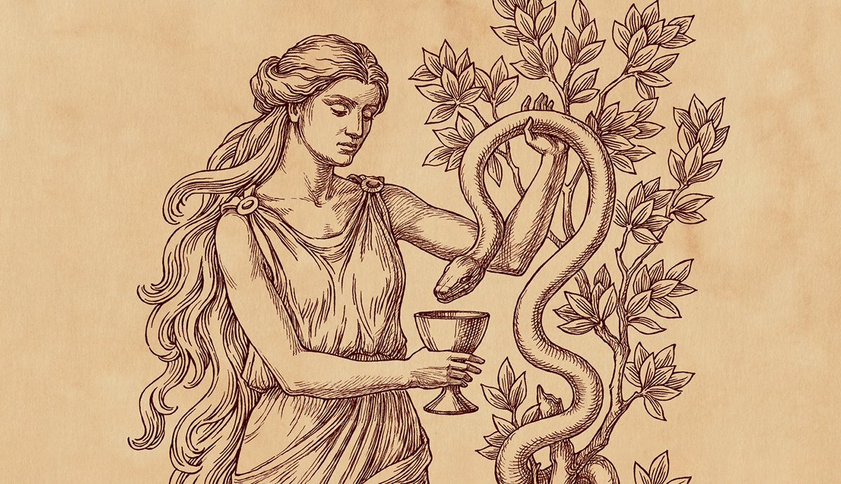
The Bowl of Hygieia
This is one of the most recognizable symbols of pharmacy. Hygieia was the Greek goddess of health and was the daughter of Asclepius, the god of medicine, although in some versions of the myth she is described as his wife. Hygieia often held a bowl or chalice, presumably filled with medicinal potions, with a serpent encircling it. The bowl and serpent together depict the practice of pharmacy as the application of herbs and plants (modern-day drugs) using the methods of medicine to contribute to overall health.
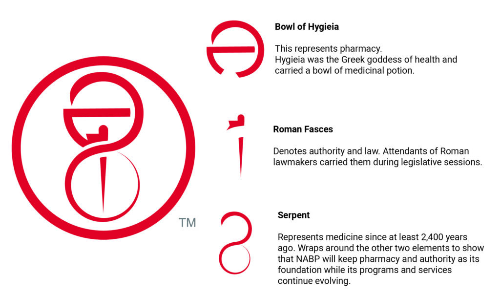
Roman Fasces
Pictured as a single rod in the NABP symbol, the fasces is actually a bundle of wooden rods tied together with a red strap that was carried by the attendants of members of the Roman legislature. The fasces exuded the power of the law and the authority of the legislators. NABP and the boards of pharmacy use their power under the law to affect pharmacy regulations in the interest of protecting public health.
The Serpent
The serpent has represented medicine for at least 2,400 years, since it’s association with Asclepius, the Greek god of medicine. In our symbol, the serpent wraps around the bowl and rod in a figure 8, tying each element together. It reminds us that NABP’s work will continue to adapt and change as we support the boards.
Combining the old with the new, NABP’s updated brand design elements convey us as a future-focused thought leader that is informed by a rich history. Because we will always be linked to the past as we look toward the future.